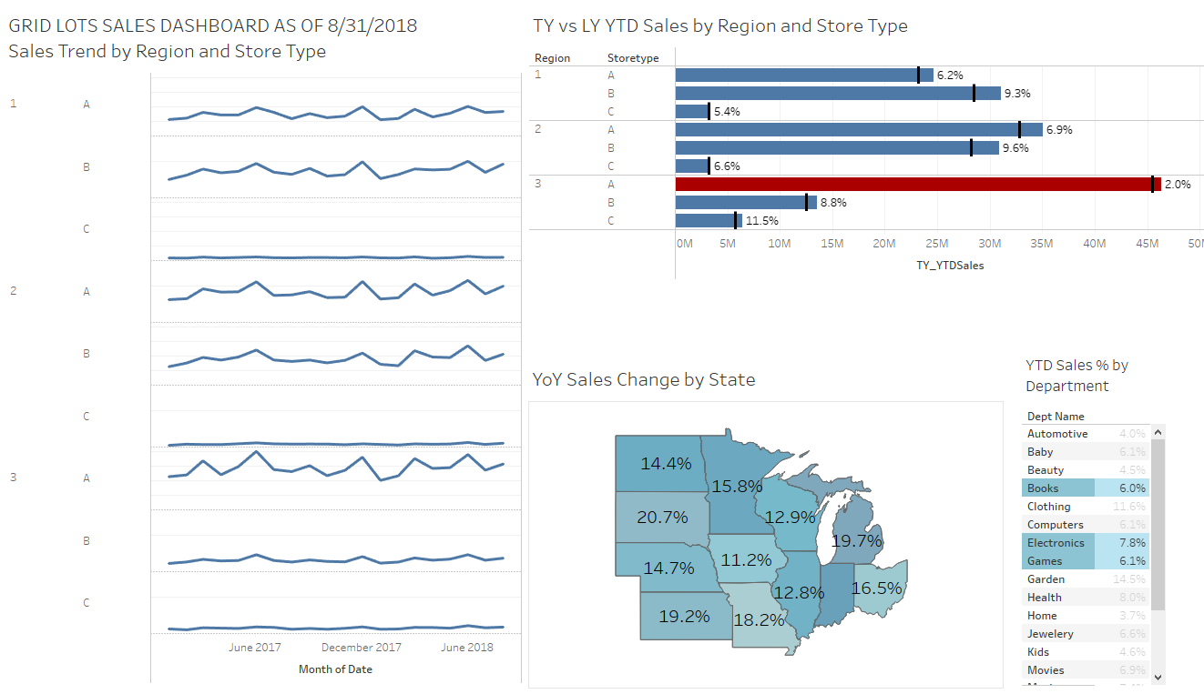
This is another data analytics project that I created for my Data Analytics certification with the purpose of collecting sales data, creating visualizations of the data, and then drawing insights from the data to inform possible business strategies. The data comes from an imagined chain in the US called “Gridlots,” which is seeking to use the data to better understand the performance trends of its various outlets based on their, location and product offering.
First, the data was collected and staged in Excel, and a dashboard was created using pivot tables, pivot charts, and slices. Once the project was finished in Excel, the data from the workbook was imported into Tableau, where another dashboard with even more in-depth visualizations and functionality was created. There is a link to this presentation below, as well as links to both the Excel workbook in OneDrive and the Vizz on Tableau Public.
Staging Data and Excel Dashboard (365 Download)

